 |
| Picnic Anyway 1945 |
Saturday, July 26, 2014
Woo hool!!!
Just learned that my painting was accepted for the 2014 International Watercolor West Juried Exhibition, and since this is the third time, I qualify as a signature member! If only my sister were here for me to share the news with -- she was always my best viewer and greatest supporter, and she'd have taken pleasure in this success. Anyway, here is the painting that will be in the show:
It is based on an old photograph of my five aunts at a family picnic after their parents had been killed in a car-train accident and before the war ended.

Saturday, July 12, 2014
Digital Collage
The following piece has parts of seven different watercolors in it, and the shadow figure was drawn in freehand. Does that make it a mixed media piece?
 |
| Bird Walk 1995 |
Here is another one, with even more pieces of old paintings and an old photograph in it:
 |
| Lost Girl |
Monday, June 30, 2014
Experimenting with Digital Art
After my husband gave me a new iPad, I bought a program called "ProCreate" for creating digital artworks. I have been experimenting with "painting" over photographs and over old watercolor paintings, with creating photo collages, and with "drawing" layered "paintings." So far, I have become obsessed and greatly enjoy this last process. I can give "ProCreate" a highly positive review. Here are my recent efforts.
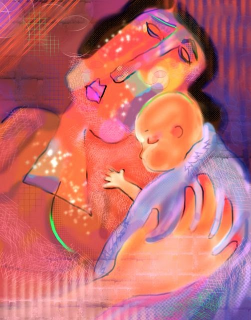 |
| Grandma Love 8 |
 |
| Sisters 2 |
 |
| Sibling Rivalry |
Sunday, June 15, 2014
More Grief
This series of artwork all began with a selfie photo I took, while I was crying and holding a sick, sleeping baby in a dark room. I put it together in a Warhol-like picture, shown in my last post. After that, I did an ink and watercolor painting based on that photo. And next, I made a digital "painting" on my iPad, using ProCreate. My husband, who gave me the iPad for my birthday, took a picture of me working on it. Pictures of all this are below.

Comparing the ink/watercolor with the digital work, I begin to wonder which more effectively conveys my intent, do both convey grief, are they both "art"? Both absorbed me while I was working on them, and the digital one was actually fun, since I was learning something new. I had fun with grief?? Art IS transformative! (At least for the artist.)
 |
| Sad Selfie |
 |
| Watercolor Grief |
 |
| Digital Grief |
Comparing the ink/watercolor with the digital work, I begin to wonder which more effectively conveys my intent, do both convey grief, are they both "art"? Both absorbed me while I was working on them, and the digital one was actually fun, since I was learning something new. I had fun with grief?? Art IS transformative! (At least for the artist.)
Sunday, June 8, 2014
Grief 1 and 2
After the sudden, unexpected death of my dear sister in March, I stopped painting. She was my best viewer and best friend, and it's hard to go on without her. On Friday I held my poor, sick little grandson for two hours in a dark room, so he could sleep, and in those two hours I thought about my sister and cried. Finally, I thought, "Well, this is my life right now. I might as well paint it, too." So here are two works about grief.


Thursday, February 27, 2014
2014: Starting to Paint Again
Last month I attended a workshop with Katherine Chang Liu, and I felt inspired to explore an emotionally charged issue for me. This month I attended a workshop with Christopher Schink, and I felt like taking an intellectual approach to painting and simply enjoying the challenge of trying some new techniques. Here are the paintings, two from Katherine's workshop and two from Toph's; can you guess which is which?


Here's some helpful hints: The titles of the paintings, from top to bottom, are "Silent Spring 1," "Silent Spring 2," "Red Boot," "The Young Guitarist 2."
Here's some helpful hints: The titles of the paintings, from top to bottom, are "Silent Spring 1," "Silent Spring 2," "Red Boot," "The Young Guitarist 2."
Thursday, November 28, 2013
Art or Cartoons?
When we were children, my sister and I watched a TV show that taught kids how to draw cartoons (Tom Hatten), and I got pretty good. All my life, I drew cartoons, for fun, to entertain children, to pass the time in long meetings. When I started painting, it felt like a criticism if my paintings were compared to cartoons. But after a few years, I began to think, well, that's what I'm good at so I might as well go with it. Recently, I did cartoons of unicorns and rainbows all over an 8 foot piece of butcher paper for my granddaughter's "Rainbow Unicorn Birthday" party, as a table cloth the children could color. I did all of this free hand with a magic marker:

After seeing the work of Milton Avery, I felt encouraged to go ahead and do cartoon-like paintings. Now in critiques, the teachers warn me not to get too "cartoony." There are some ways to reduce the cartoon look -- mute the colors and make the heads small. In the oil painting below, I muted the colors and eliminated the heads.

It has also been pointed out that figures in motion look more cartoony than still figures. Since I love to paint dancers, this problem presents a challenge -- how to paint cartoonish dancers that are not TOO cartoony. The oil painting below is not finished, but it is an attempt to paint wonky dancers that are not too cartoony.

Well, I think it's too cartoony, but I like it anyway. Still have to paint the hair, spotlights, and shoes. Not sure what color to make the shoes.

After seeing the work of Milton Avery, I felt encouraged to go ahead and do cartoon-like paintings. Now in critiques, the teachers warn me not to get too "cartoony." There are some ways to reduce the cartoon look -- mute the colors and make the heads small. In the oil painting below, I muted the colors and eliminated the heads.

It has also been pointed out that figures in motion look more cartoony than still figures. Since I love to paint dancers, this problem presents a challenge -- how to paint cartoonish dancers that are not TOO cartoony. The oil painting below is not finished, but it is an attempt to paint wonky dancers that are not too cartoony.

Well, I think it's too cartoony, but I like it anyway. Still have to paint the hair, spotlights, and shoes. Not sure what color to make the shoes.
Sunday, July 28, 2013
Two New Oil Paintings
A few days ago, I took the washed off canvas board from the last post and painted a much better painting on it with water mixable oils:
Today I tried another, titled "There Used to Be Birds," to express my concerns about the deterioration of our environment and the loss of birds and other wildlife. What kind of empty, silent world are we leaving our grandchldren?
Not sure I like the green sea and may change it.
Notes on technique: I got some of the Winsor Newton Artisan brushes that were supposedly designed specifically for use with water mixable oils, and I have to admit that they work better than any of my other brushes. Today, between colors, I rinsed the paint off the brush in a bucket of water and then squeezed it dry with a paper towel. Used a lot fewer brushes that way, and the technique seemed to work fine.
 |
| The Trek 5 |
Today I tried another, titled "There Used to Be Birds," to express my concerns about the deterioration of our environment and the loss of birds and other wildlife. What kind of empty, silent world are we leaving our grandchldren?
 |
| There Used to Be Birds |
Not sure I like the green sea and may change it.
Notes on technique: I got some of the Winsor Newton Artisan brushes that were supposedly designed specifically for use with water mixable oils, and I have to admit that they work better than any of my other brushes. Today, between colors, I rinsed the paint off the brush in a bucket of water and then squeezed it dry with a paper towel. Used a lot fewer brushes that way, and the technique seemed to work fine.
Friday, July 12, 2013
More Experiments with Water Mixable Oils
Today I tried another thought I had -- what would happen if I put a layer of white water mixable oil paint down first and then mixed colors into it directly onto the paper? After all, white is the most commonly added color to oil paints, so I could save a lot of mixing. Well, not a good idea! There was no way to get a real dark (that one dark was done without the white layer) and no way to control the color I wanted. Still, it's fun to experiment, even if the results aren't that great. Here's the painting:

In addition to color problems, the two figures are too similar in shape and they are too similar in size, so the painting is not interesting. It was an experiment, so what the heck, I decided to scrape off the woman's head and start over:

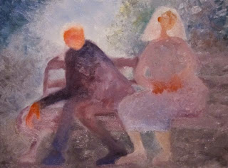

In addition to color problems, the two figures are too similar in shape and they are too similar in size, so the painting is not interesting. It was an experiment, so what the heck, I decided to scrape off the woman's head and start over:

Maybe I improved it a bit:

And to report the results of prior experiments -- the masking tape that I used to tape the oil paper to the board came off fine after the paint dried to the touch. Freezing the left over paint, as recommended by Bernard Fallon, worked just fine, too. After defrosting, the paint was like new. Some experiments work!
Sunday, July 7, 2013
Second Oil Painting
My second experiment with water mixable oil paint is small (8 x 10) like the first one. I did not mix in any watercolor this time, just all oil. Between colors, I wiped the brush off with a paper towel (did not clean it in water) and found I needed a different brush for each color family. When I was done, I remembered that at a Huntington Beach Art League demo Bernard Fallon said to save partly used oil paint by putting it in the freezer, so I scraped up all the paint off the paper palette and put it in a plastic container in the freezer. We'll see if it stays usable. I taped the oil paper to a board, and this time I will let the paint dry to the touch before removing it. We'll see how that works.
Clean-up was a snap: Throw away the scraped off paper palette and wash the brushes with soap and water!
I was influenced by Milton Avery in this painting. The colors are more grayed than they show on my computer screen. It is based on my reddish-haired grandson Sam.
 |
| The Trek 4 |
I was influenced by Milton Avery in this painting. The colors are more grayed than they show on my computer screen. It is based on my reddish-haired grandson Sam.
Saturday, July 6, 2013
Painting with Grandchildren Again
One of my greatest pleasures is painting with my grandchildren. I cut up paintings I don't like so they can paint on the back (they paint fast and can really go through the paper!). I will sometimes take a piece of an old painting and paint on it just to disguise the fact that I am supervising. And sometimes I am rewarded with a small painting I kind of like, such as this one:
 |
| The Young Guitarist |
Friday, July 5, 2013
Results of Experimenting with Water Mixable Oil Paints
The oil painting in my last post took 72 hours to dry to the touch, whereas others have found that the water mixable oils take 48 hours to dry to the touch. I live by the beach, where it is a bit humid, and perhaps that causes the difference in drying time. The parts of the painting that had watercolor paint mixed in with the oils dried faster. Those parts also had a matte finish, while the pure water mixable oil parts had a slightly glossy finish. If anyone minds these differences in finish, some water mixable varnish can create a consistent finish. There seemed to be no difference between the parts of the painting done with an oil-watercolor mix and pure water mixable oil in terms of adherence to the surface (which was Arches oil paper) and flexibility (I bent and rolled the paper). I conclude that it is indeed OK to mix watercolor paints with water mixable oil paints. Now the only remaining question is: Is my painting considered an oil or a mixed media work?
Sunday, June 30, 2013
My First Oil Painting
Because it stays workable for quite a long time and it's easy to blur edges with it, I have been thinking about oil paint lately. I finally broke down and bought myself 10 sheets of Arches "huile" paper for oil paints and five tubes of Winsor & Newton Artisan water mixable oil paint, yellow, red, blue, white, and black. Since I use bristle brushes for watercolor, I had plenty of brushes appropriate for oil. Today I decided to experiment!
On a small (8 x 10) sheet of paper taped to a piece of plexi-glass, I quickly drew a picture similar to the one I did in my last post. I mixed some colors on a paper palette, and I also tried mixing some colors right on the huile paper as I painted. I remembered that with oil, you paint dark to light, the opposite of watercolor, but I ignored that rule. I experimented with various brush strokes and even finger applications of paint.
The really big experiment was combining watercolor paint with the oil paint. I searched the web for any information about doing this, but found almost nothing, other than the rather obvious advice of not painting watercolor on top of an oil painting. My guess was that if you can add water to these paints, then you could also add watercolor, if you mixed it in, instead of or with water. I had not bought any burnt umber Artisan paint, so I tried adding my burnt umber watercolor to the Artisan white. And since I had bought a warm red (cadmium hue), I could not make a proper violet, and so I mixed some mineral violet into the Artisan white, too. We'll see what happens as the painting dries. And here it is:
On a small (8 x 10) sheet of paper taped to a piece of plexi-glass, I quickly drew a picture similar to the one I did in my last post. I mixed some colors on a paper palette, and I also tried mixing some colors right on the huile paper as I painted. I remembered that with oil, you paint dark to light, the opposite of watercolor, but I ignored that rule. I experimented with various brush strokes and even finger applications of paint.
The really big experiment was combining watercolor paint with the oil paint. I searched the web for any information about doing this, but found almost nothing, other than the rather obvious advice of not painting watercolor on top of an oil painting. My guess was that if you can add water to these paints, then you could also add watercolor, if you mixed it in, instead of or with water. I had not bought any burnt umber Artisan paint, so I tried adding my burnt umber watercolor to the Artisan white. And since I had bought a warm red (cadmium hue), I could not make a proper violet, and so I mixed some mineral violet into the Artisan white, too. We'll see what happens as the painting dries. And here it is:
 |
| The Trek 2 |
Compare this one to the painting in the previous post. And p.s., I just read that bristle brushes don't do well with water mixable paint, because they get mushy when wet. I didn't notice that, but it was a small painting. Winsor & Newton recommends a special synthetic bristle brush that they make. Hmmmmmm.
Saturday, June 29, 2013
Painting after Dark
In the past, I have avoided painting in the evenings, after dark, because of vision difficulties. No matter the amount of artificial light, the next day my paintings simply did not look like I had painted them -- the colors were always slightly off. But one can only watch so many re-runs or read so many books, so I decided to paint after dinner last night, thinking that maybe my new paint application method would work OK in artificial light. I was right! This morning, this painting looked just the way I had painted it:
 |
| The Trek |
However, this photo of it does not show the colors accurately -- in reality it is somewhat more muted. There are problems with this painting anyway, and maybe I will try it again. For now, it's an homage to Nathan Oliveira.
Monday, June 24, 2013
Trying an Interior
Some artists like to paint the insides of homes or buildings, also known as interiors. Vincent Van Gogh famously painted his bedroom, and the first place winner at Watercolor West last year depicted a hallway with a view out a screen door. I have never painted an interior.
As I was hanging out in my daughter's apartment last week while dog sitting, I noticed that the shapes of receding walls with different types of light on them would make an interesting painting, so I decided to make my own attempt at an interior. The resulting painting is also an homage to Richard Diebenkorn. Not sure I like it, but maybe it has potential for a do-over.
As I was hanging out in my daughter's apartment last week while dog sitting, I noticed that the shapes of receding walls with different types of light on them would make an interesting painting, so I decided to make my own attempt at an interior. The resulting painting is also an homage to Richard Diebenkorn. Not sure I like it, but maybe it has potential for a do-over.
 |
| Secrets 4 |
Saturday, June 22, 2013
Finished a Painting Today
One graduation, one wedding, and one week of dog-sitting (so married couple could go on their honeymoon) are now done! (One more wedding to go.) Time to paint! Today I completed a painting I began at ISS, and here it is:
 |
| Secrets 3 |
I used the new paint application method I developed at ISS, and I lost a few more edges than usual. It feels good to apply what I learned and to like the results.
Thursday, May 30, 2013
"New" Painting Methods
Here's a painting I did using the new (for me) paint application method I developed at the Intensive Studies Seminar along with an increase in lost edges as was recommended there. I actually really like it, and as art teachers have said, it's important to be able to say positive things about one's own paintings. I call it "Secrets."


Sunday, May 19, 2013
Intensive Studies Seminar, Taos, New Mexico
Am surprised to realize that I haven't yet posted about the fabulous time I had at the Intensive Studies Seminar at the end of April this year. Four instructors (Katherine Chang Liu, Fran Larsen, William Lawrence, Christopher Schink) and eight days of painting in a great studio space in a gorgeous part of the country. It was artist heaven! While there, I focused on the figure, and I painted 16 paintings of which 3 or 4 have potential. I feel I made progress in losing edges and developing a textural style of applying paint, sort of the way oil paint is applied. Here are some of the works I did there:

With four different instructors working with small groups of us on different days, we were warned that we would get contradictory advice at times. One person said the baby's foot above was key to that painting's success, while another said it had to go. One person thought the dancer with the green shoe below was my least effective painting, while another thought it was the most effective. In a way, this sort of contradictory feedback forced us to commit to our own ideas -- I love the baby's foot and I don't think that dancer picture is very good.

Then, just to try something different, I did a nonobjective painting, below. One instructor liked it and another exclaimed, "That's not you!" I enjoyed painting it, but it's not me.

Then, just for fun, I decided to do a couple of whimsical bird portraits, after seeing a slide show of people portraits by Rufino Tamayo. There were nesting magpies near the hotel, and mockingbirds and many other birds to watch.

With four different instructors working with small groups of us on different days, we were warned that we would get contradictory advice at times. One person said the baby's foot above was key to that painting's success, while another said it had to go. One person thought the dancer with the green shoe below was my least effective painting, while another thought it was the most effective. In a way, this sort of contradictory feedback forced us to commit to our own ideas -- I love the baby's foot and I don't think that dancer picture is very good.

Then, just to try something different, I did a nonobjective painting, below. One instructor liked it and another exclaimed, "That's not you!" I enjoyed painting it, but it's not me.

Then, just for fun, I decided to do a couple of whimsical bird portraits, after seeing a slide show of people portraits by Rufino Tamayo. There were nesting magpies near the hotel, and mockingbirds and many other birds to watch.
 |
| Tamayo Magpie |
 |
| Tamayo Mockingbird |
I brought home a couple of unfinished paintings, and they will get me started painting again after all the upcoming life events (birthdays, graduations, weddings) that will keep me from it for a while. I feel extremely fortunate and grateful that I got to go to ISS this year.
Monday, February 25, 2013
A Most Enjoyable Workshop
Just returned from a wonderful three-day painting workshop on expressive color with my favorite art teacher, Christopher Schink, at Sylvia Megerdichian's lovely Art Box Studio in Upland. After helpful reviews of our work and between informative and inspiring slide shows and entertaining demonstrations, we worked on our own paintings in different color schemes. We were urged to try colors outside of our comfort zone.
As an exercise, we divided our paper into fourths or sixths and painted the same subject with all different color combinations. Here is my exercise:

Next I chose to do a painting based on hue contrasts, in the Post-Impressionist 2 color scheme: all pure hues, with a little black. Showing the class this painting, Toph said, "This is how grandfathers feel about grandchildren."

Then I did a painting based on contrasts in intensity, in a "Turner" or "Milton Avery" color scheme: tints, tones, and grays. Showing the class this painting, Toph said, "And this is how grandmothers feel about grandchildren."

This workshop was so much fun and I learned so much that the only problem is that now I am sad that it is over. But there is the Intensive Studies Seminar in Taos to look forward to in April!
As an exercise, we divided our paper into fourths or sixths and painted the same subject with all different color combinations. Here is my exercise:

Next I chose to do a painting based on hue contrasts, in the Post-Impressionist 2 color scheme: all pure hues, with a little black. Showing the class this painting, Toph said, "This is how grandfathers feel about grandchildren."

Then I did a painting based on contrasts in intensity, in a "Turner" or "Milton Avery" color scheme: tints, tones, and grays. Showing the class this painting, Toph said, "And this is how grandmothers feel about grandchildren."

This workshop was so much fun and I learned so much that the only problem is that now I am sad that it is over. But there is the Intensive Studies Seminar in Taos to look forward to in April!
Monday, February 18, 2013
Painting Again!
After not having painted for over three months -- had a show and taught a workshop, got that respiratory thing going around, adult kids moved back in, a new grandchild was born -- I decided today to get myself warmed up and back into the swing of painting by just playing and doing a nonobjective painting. That was fun and got me going, so I tried a Linda Kemp negatively painted landscape and then a negatively painted nature study. Just completing three paintings today makes me feel much more like a human being, though none of them are that great.
 |
| "The Mountain Gave Birth to Peace and Harmony" |
 |
| "Pond Trees" |
 |
| "Grape Vines" |
Subscribe to:
Posts (Atom)